Unpack - A service that keeps a digital inventory of possessions during a move.

Year

2026

Project

End to end mobile first website

Role

Indiviual contributor

Client

Phase 1 of Designlab UX Bootcamp

The idea

A service to keep a digital inventory of possessions during a move. It lets users record a searchable inventory, then generate a digital label for each box that, when scanned, pulls up it's contents on any device.

A service to keep a digital inventory of possessions during a move. It lets users record a searchable inventory, then generate a digital label for each box that, when scanned, pulls up it's contents on any device.

Problem

When moving to a new place no single task too difficult on it’s own. It was the doing all of them simultaneously that made peoples experience genuinely overwhelming.

When moving to a new place no single task too difficult on it’s own. It was the doing all of them simultaneously that made peoples experience genuinely overwhelming.

Goal

To reduce moving stress by helping movers pack smart, so day one essentials are instantly on hand and everything else is just a search away?

To reduce moving stress by helping movers pack smart, so day one essentials are instantly on hand and everything else is just a search away?

Result

The user test did accomplish the success metrics. Initial concept testing showed 80% of users accomplished the task without intervention. 40% of users missed the labels tab and therefore struggled to locate how to print multiple labels. This feedback was addressed in the latest prototypes.

The user test did accomplish the success metrics. Initial concept testing showed 80% of users accomplished the task without intervention. 40% of users missed the labels tab and therefore struggled to locate how to print multiple labels. This feedback was addressed in the latest prototypes.

Empathise

What did I want to find out?

I initially had a wider scope of research and broadly looked into the whole process of moving internationally. I wanted;

  1. To understand what difficulties the user had before, during and after the move.

  2. To understand what went well during the move and why.

  3. To determine where users looked for help with any problems or questions they had.

  4. To understand if users still need assistance after their move.

  5. To understand why the users need/want to move to another country.

I initially had a wider scope of research and broadly looked into the whole process of moving internationally. I wanted;

  1. To understand what difficulties the user had before, during and after the move.

  2. To understand what went well during the move and why.

  3. To determine where users looked for help with any problems or questions they had.

  4. To understand if users still need assistance after their move.

  5. To understand why the users need/want to move to another country.

Speaking to people, finding some problems.

I wanted to know ways in which people struggle during international moves so that I could understand the best solution that reduces stress and aids in the process of setting up in a new country.

I wanted to know ways in which people struggle during international moves so that I could understand the best solution that reduces stress and aids in the process of setting up in a new country.

Who we spoke to

Two recently arrived in New York, one US domestic mover, one NZ→UK and one serial international mover. Ages ranged from mid-30s to late 30s. All had moved internationally at least once; most had moved multiple times.

Insights

The "chicken or egg" admin stack is the dominant pain point.

The order of operations is never obvious.

Official sources fail, peer experience is trusted.

Immigration is deeply underserved and uniquely stressful.

Patterns

The admin dependency chain is felt by virtually everyone moving internationally, regardless of destination.

Official information is unreliable; peer experience is trusted. Expat Facebook groups, Reddit, personal blogs, and word-of-mouth are a preffered.

Affinity mapping helped define the users problems, heres the summary

Moving is hard on both ends, the departure involves its own coordination, costs, and stress that rivals the arrival. Day-one living needs advance preparation, and short-term accommodation becomes a drain the longer it drags on.

Financially, costs pile up fast and setting up banking in a new country comes with real hurdles. There's no single checklist or resource for the setup process. Tasks all vary by country and have to be figured out independently, often through trial and error.

Community proved to be a stabilising force, for finding local services, feeling welcomed, and getting trustworthy advice. Similarly, finding work was key to feeling settled.

Define

POVs and HMWs helped me focus on the right problems and find an opportunity

POVs and HMWs helped me focus on the right problems and find an opportunity

POV

POV

I’d like to explore ways to help people moving into a new place to reduce the stress of unpacking boxes because not knowing which box holds the basics turns the first days in a new home into a scavenger hunt at a time when there’s a lot of other tasks to complete.

I’d like to explore ways to help people moving into a new place to reduce the stress of unpacking boxes because not knowing which box holds the basics turns the first days in a new home into a scavenger hunt at a time when there’s a lot of other tasks to complete.

HMW

HMW

How might we help movers pack with unpacking in mind, so that day-one essentials are always the easiest things to find on arrival?

HMW

HMW

How might we give movers a searchable inventory of everything they've packed so that finding any item on arrival takes seconds rather than hours?

How might we give movers a searchable inventory of everything they've packed so that finding any item on arrival takes seconds rather than hours?

*I actually had quite a few potential opportunities that came up during the research phase. I decided to focus on this problem because it fit the scope of the project well and was a problem that was common for both international and continental movers.

I created personas that transformed the research into a practical reference tool that kept me focused on the right users throughout the entire design process

I created personas that transformed the research into a practical reference tool that kept me focused on the right users throughout the entire design process

Joe Bloggs

Joe Bloggs

Trusts experience of others | Researches everything | Come to terms with it being a grind

Trusts experience of others | Researches everything | Come to terms with it being a grind

  • 28

  • Graphic Designer

  • Canada --> UK

  • Moving with partner

  • Moving looking for a job

  • Has to do visa application without help

  • 28

  • Graphic Designer

  • Canada --> UK

  • Moving with partner

  • Moving looking for a job

  • Has to do visa application without help

Jolene Blanche

Jolene Blanche

Joins Facebooks groups | Stays in touch with family | Googles cultural differences

Joins Facebooks groups | Stays in touch with family | Googles cultural differences

  • 33

  • Astro Physicist

  • France --> USA

  • Leaving family behind

  • Moving to work on special project

  • Job has sponsored her move and is helping with visa

Using “How Might We” questions as the foundation, I explored a range of brainstorming techniques, including playing with opposites and analogous inspiration to broaden my thinking and ultimately converge on a single idea to move forward with.
The idea
A service to keep a digital inventory of possessions during a move.

Who?

For someone who needs to know exactly where things are the moment they arrive in a new place.

What it does?

It gives the user a space to record the inventory of possessions and make intelligent suggestions of what to pack where.

Allows users to create a digital label for the box, when scanned can be accessed by any digital device.

How?

It can allow the user to digitally search for items they need when arriving, allowing the user to locate and unpack the essentials without having to search through all the boxes.

Storyboarding early in the design process allowed me to visualize the user's journey in context, helping me build empathy and identify pain points before any design decisions are made.

Storyboarding early in the design process allowed me to visualize the user's journey in context, helping me build empathy and identify pain points before any design decisions are made.
  1. Jolene is getting ready for her move to the US, she’s preparing and packing.


  2. She wants to make sure she can find important essentials on when she arrives so she can worry less about that and start her new job with confidence.


  3. Her moving company are partnered with this service to help customers organise belongings.


  4. She felt less stress and was excited about her move.


  5. She used the service to help packing.


  6. She arrived in the US, found her fav thing and felt confident about her first day in a new job.
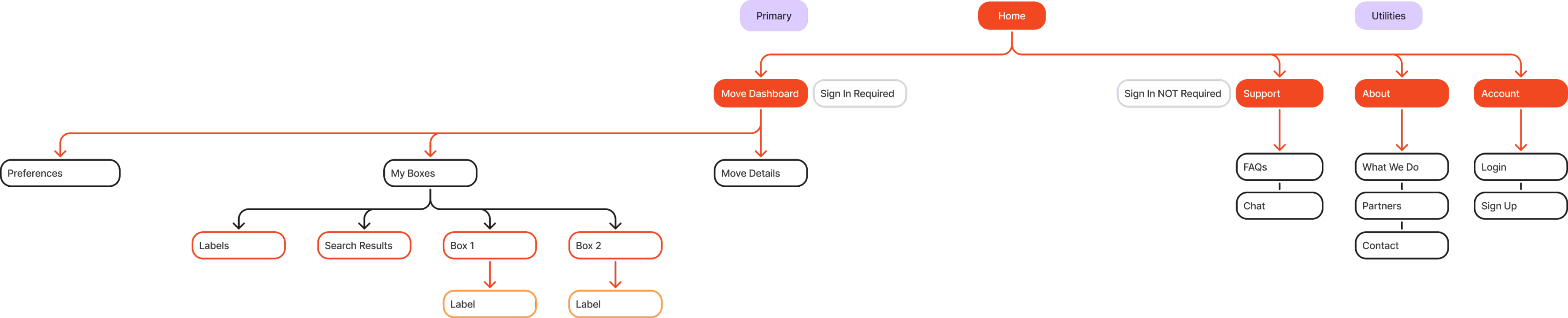
I created a sitemap to define the overall structure and hierarchy of the product, giving both the wider design and development team a clear blueprint of how content and screens connect.

I created a sitemap to define the overall structure and hierarchy of the product, giving both the wider design and development team a clear blueprint of how content and screens connect.
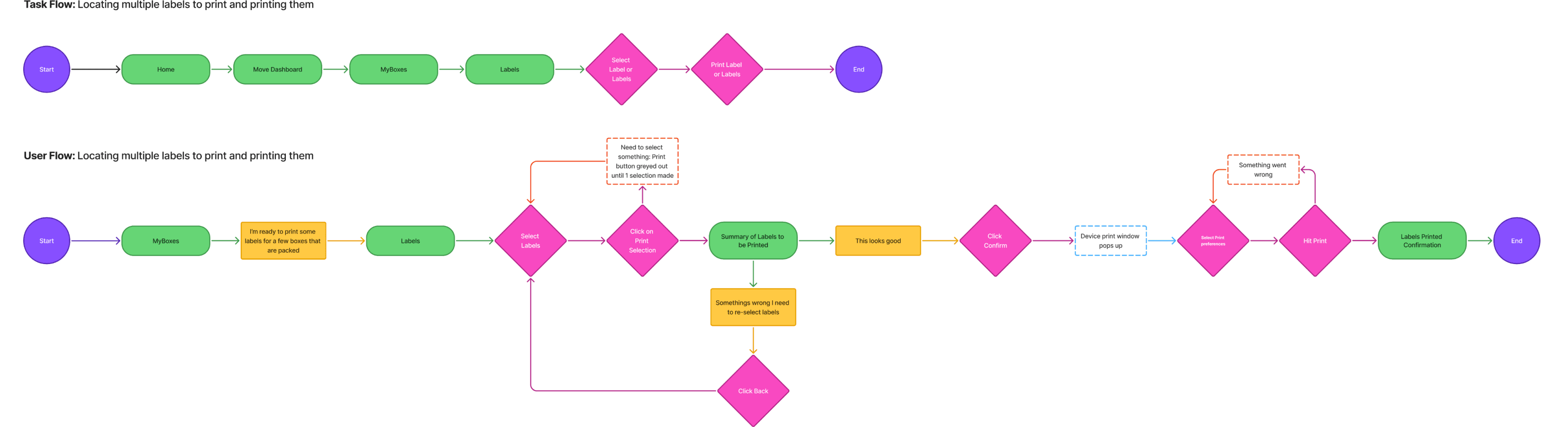
I created task flows and user flows to map out the steps a user takes to complete a goal, ensuring the experience is logical, intuitive, and free of unnecessary friction before moving into making Lo Fi Wireframes.

Flow 1

Flow 1

Creating a new box and making it a priority

Creating a new box and making it a priority

Flow 2

Flow 2

Locating multiple labels to print and printing them

Locating multiple labels to print and printing them

Flow 3

Flow 3

Searching for specific items in boxes

Searching for specific items in boxes

Ideate

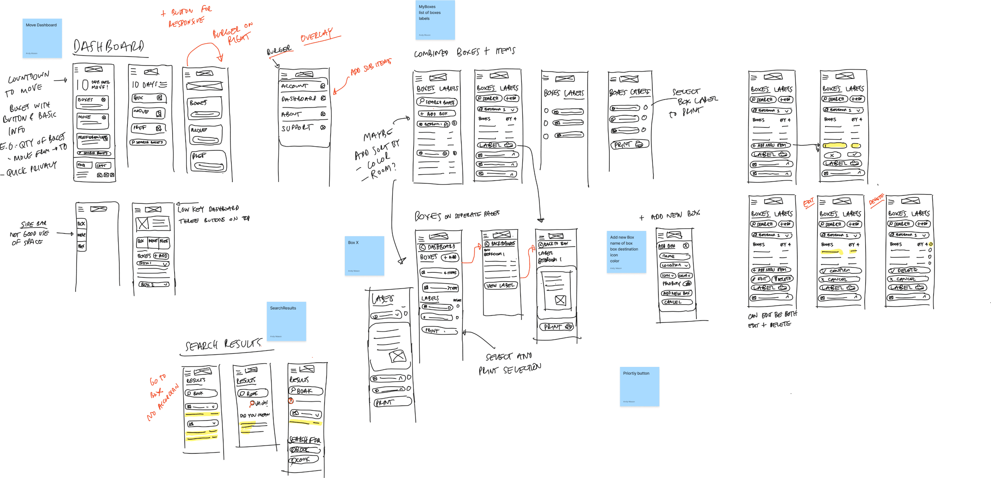
I then used my iPad to sketch low fidelity wireframes to quickly explore and communicate layout ideas, allowing for fast iteration and early feedback before investing my time in high fidelity designs.

I then used my iPad to sketch low fidelity wireframes to quickly explore and communicate layout ideas, allowing for fast iteration and early feedback before investing my time in high fidelity designs.

*A note. At this point I also used Ai (Figma Make) to make some initial lo fi wireframes. I ended up not using the designs I prompted as I wanted more control over the design, and it would have taken longer to refine the Ai design than roughly layout what I was thinking. Ai would have been more useful to try different iterations once my initial design was down on the page.

I translated the sketch wireframes into digital low fidelity wireframes, with each of the three user flows explored to ensure every screen was purposefully connected and reflective of the steps a user takes to complete their goals.

I translated the sketch wireframes into digital low fidelity wireframes, with each of the three user flows explored to ensure every screen was purposefully connected and reflective of the steps a user takes to complete their goals.

The feedback received during design crit sessions included;

  1. Sizing and spacing of each item should be increased and they are currently too close together and could be harder to press.

  2. Including more icons to better represent box contents, as room based icons look repetitive.

  3. The rounded boxes on the dashboard don’t look right with the title so close to the corner.


Iterations were made in the higher fidelity wireframe prototypes.

The feedback received during design crit sessions included;

  1. Sizing and spacing of each item should be increased and they are currently too close together and could be harder to press.

  2. Including more icons to better represent box contents, as room based icons look repetitive.

  3. The rounded boxes on the dashboard don’t look right with the title so close to the corner.

Iterations were made in a higher fidelity wireframe prototypes.

I collated a mood board to gather visual inspiration, which culminated in a style tile defining the final color palette and typeface choices that would guide the visual direction of the product.

I collated a mood board to gather visual inspiration, which culminated in a style tile defining the final color palette and typeface choices that would guide the visual direction of the product.

Style Tile

Style Tile

The final color palette asnd typeface choices

The final color palette and typeface choices

I designed a logo to visually represent the brand identity, ensuring it aligned with the overall visual direction and could be consistently applied across the product.

I designed a logo to visually represent the brand identity, ensuring it aligned with the overall visual direction and could be consistently applied across the product.

Prototyping

This is the first iteration of the high fidelity wireframes for key frames in the three user flows, the examples shown are;

  1. The dashboard

  2. The boxes tab showing add box

  3. The add new box flow

  4. The add new item flow

  5. The labels tab

  6. The search results

1

2

3

4

5

6

I made interactive prototypes and put them through five user testing sessions to gather user feedback on the current design, helping to identify any usability issues and validate design decisions before finalizing the product.

Test

80%

of users accomplished the task without intervention

40%

of users missed the labels tab and therefore struggled to locate how to print multiple labels

The user test did accomplish the success metrics, all users were confident in using the website and perceived it to be easy. Only one user needed intervention on one of the tasks. There was only 3 errors across the users, 2 users didn't make any mistakes.

  • Error Rate - no more than 1 error per task flow per participant

  • Confidence Score - average of 4 out of 5 or higher across all tasks

  • Perceived Ease - average of 5 out of 7 or higher per task

What worked well?

Adding a new box worked well

Making the box a priority was easy

Adding a new item flow was quick and efficient

Selecting the labels to be printed and then printing them was completed easily by each participant

Using the search bar was easy, and most participants found items quickly.

What to change immediately?

The main issue was 40% of participants not finding the labels tab and looking for labels under the boxes instead.

Move the Labels to a tab on the dashboard.

Add select all option to rooms e.g. select all boxes in joeys bedroom.

Add a back to search button.

What to change later?

Search results vs search suggestions look similar.

Relocate the print button, sticky at base of screen?

Look into adding print preview on print confirmation tab.

Look into making priority boxes more visible when in the list of boxes.

Auto drop down new box to add items so it’s more clear initially after adding a new box.

Maybe add shortcut to add new item on new box confirmation.

Refine

I updated the design based on the feedback and insights gained from the user testing sessions.

  1. Moved the labels to a seperate tab on the dashboard.

  2. Add select all option to rooms e.g. select all boxes in joeys bedroom.

  3. Add a back to search button.

  4. Changed some of the wording in confirmation pages.

Examples of the 3 flows built to test the prototypes are presented as videos below. Each follows the updated designs.

Adding a new box and item

Adding a new box and item

Viewing and printing a label

Viewing and printing a label

Searching for a specific item

Searching for a specific item

What next?

As with any project there has to be an end point. If I had more time here's what I would do.

As with any project there has to be an end point. If I had more time here's what I would do.

Next Steps?

With more time, I'd add some more differentiation between the search results and search suggestions.

I would relocate the print button to be stuck to the base of the screen, so that a user does not have to scroll through all the labels to find the button.

I would add a print preview step, so the user can check what the label will look like prior to confirming the print.

I would look at increasing the visibility of priority boxes in the list view as well as having an expandable summary at the top of the page.

I would auto drop down new box to add items so it’s more clear initially after adding a new box.

I would add a shortcut for adding items straight from the 'box confirmation' modal, because this is the logical next step when a user is adding a new box.

All of these items were either brought up as feedback during user test sessions and crits with my mentor.

Lessons learned

As this was my first end to end UX project there have been a few lessons;

Working independently can sometimes be tricky so it's important to gain feedback where possible, for me it was joining group crits with other students and regular catch ups with my mentor.

Testing early and getting feedback can help surface bigger problems before the concepts have been too refined.

Users don't always articulate there is a project so watching closely during the testing sessions is important to be able to pick up on what their behavior is saying.

It takes time and consideration to design something that is simple for users.

What happens when the user doesn't follow the happy path is just as important as the happy path.

View more of my work

Adding a feature: View life list on a map in Merlin Bird ID

Adding a feature: View life list on a map in Merlin Bird ID

Adding a feature: View life list on a map in Merlin Bird ID

End to end application: This is some temporary text

End to end application: This is some temporary text

End to end application: This is some temporary text

Client project: This is some temporary text

Client project: This is some temporary text

Client project: This is some temporary text